The birth of Ripple
The Victorian Department of Premier and Cabinet recently launched the alpha for the Single Digital Presence. It is the foundation for a major consolidation of many ‘disparate’ Victorian websites onto a single site.
Among many great artefacts coming from this project was the creation and release of a user interface (UI) component design pattern library — Ripple.
It was officially released as open source on 30 August 2018 here: .
What is Ripple?
Ripple is the Victorian Government's new solution to a unified design for state government websites (and anyone else who wants to use it!).
It is:
- A visual design language
- Based on the Atomic Design pattern
- A VueJS component library
- Open source
What are the benefits of using such a system?
Ripple delivers the following benefits:
- Reduced development time, with access to a library of reusable components
- A consistent cross-site experience for your website's users
- An ever-growing selection of components
- Components informed by user testing to maximise the citizen experience
How can you use it ?
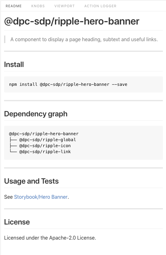
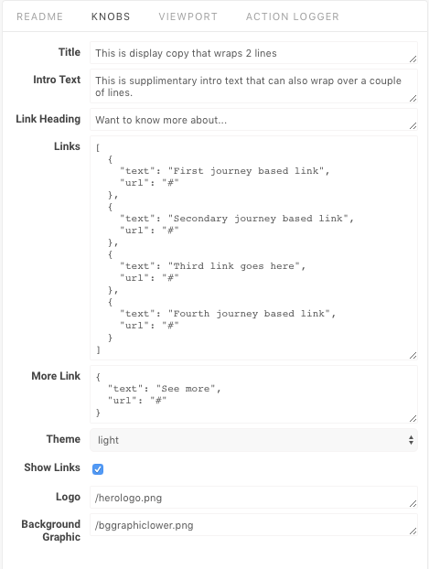
Ripple is hosted as a series of packages on . To see what each package contains, a storybook has been set up, with a readme detailing installation and dependencies, and a knobs tab that shows all the properties that can be set for a given component.
The Hero Banner component.
Hero Banner readme — with installation command, dependencies.
Hero Banner knobs — all the data that can be changed by default for a component.
A component, like Hero Banner, can be imported into your own Vue project through npm, then placed on page and given properties:
<rpl-hero-banner
title="My Title"
introText="My introduction text"
linkHeading="More Links"
:links="[ { text: 'My first link', url: '/node/10' } ]"
:showLinks="true"
/>
From here you should have your component displaying. If you need to tweak some colours, there are additional style variables that can be overridden. While these aren't yet listed in the readme, they can be found by observing the top few lines of the .vue styles.
$rpl-hero-banner-description-text-color:
rpl_color('extra_dark_neutral') !default;
Here you can see the default colour for description text is 'extra dark neutral' — if we wanted to change this to the primary colour, we could define our own stylesheet above the Ripple import, and include:
$rpl-hero-banner-description-text-color: rpl_color(primary);
This will then set the description text to primary for that particular component. Other variables like font, font size, and spacing can all be overridden both globally (for all imported components) or locally (for a particular component). It's best to keep overrides to a minimum to reduce the maintenance of custom code as new Ripple updates are released.
If you use the SDP Nuxt framework, the project structure will be set up to use Ripple and should make it easy to get started. If you plan to create your own structure to support Ripple components, it may still be worthwhile checking out the SDP Nuxt for reference.
Who can contribute and/or improve upon it?
Ripple is open source and the code can be found on . This means anyone is able to report issues, or issue Pull Requests (contribute code back). exists to help you get set up to make your own contributions.
If you wish to create a component that doesn't yet exist, it has the best chance of being useful to others if it follows a similar structure to the existing components (same coding style, with a similar component structure and stylesheets). Take the time to learn how the current library is set up and follow this as you make your own. In time, documentation will likely be released to fully detail the standards you’ll need to follow to design and code a contributable custom component.
Isn't there already something similar out there?
The more common libraries you may have heard of are Bootstrap or Foundation, and in the Australian Government space there’s also the DTA's Design System (see our blog on the Design System). The DTA’s Design System has been around for a while, and so is more mature in terms of documentation, accessibility, testing, component stability, community, and so on. However there are differences that may make Ripple a better fit for your agency.
What are the similarities between Ripple and DTA's Design System?
At their core, both Ripple and DTA's Design System provide:
- a visual design and guide (in Sketch format)
- a component library
But the differences are more in the implementation. Whereas the Design System provides styles in SASS format, separate from its React components, Ripple is built entirely in Vue with all styles integrated into Vue components. This difference means the Design System could be integrated into any system (e.g. Drupal, Wordpress), but Ripple’s components are designed to only be used in a Vue.JS site.
The following table compares the features of each (as of 27 September 2018):
| Feature | Ripple | Design System |
|---|---|---|
| Version | 1.0.0-alpha.19 | 2.0.0-beta.38 |
| Component count | 30+ | 26 |
| Style guide (.sketch) | Yes | Yes |
| Component based | Yes | Yes |
| Javascript framework | Vue | React |
| Component Styling | Integrated | Separate |
| Tests | Jest | Jest/Pa11y |
| Stylesheet preprocessor | SASS | SASS |
| Package deployment | NPM | NPM |
| License | Apache 2.0 | MIT |
| Target accessibility | WCAG 2.0 AA | WCAG 2.0 AA |
| Target browser compatibility | IE11+, modern browsers | IE8+, modern browsers 2 versions back, one version up |
Thoughts
While there are similarities between the two, ultimately the decision on which to use should be easy.
Ripple was built to integrate into Victorian Government's Tide system, and if you're going to build a site on that platform, Ripple is the best system to use.
If however you plan to take the library and integrate it into a custom system, then it's a matter of preference on the following:
- Do you prefer the visual look of the Design System or Ripple?
- Do you have experience in Vue or React?
- Do you prefer a mature offering or being involved in a new component system?
Your answers to the above should help determine what’s the best fit for your project.


